Web Design

Redesigned for Better Mobile UX

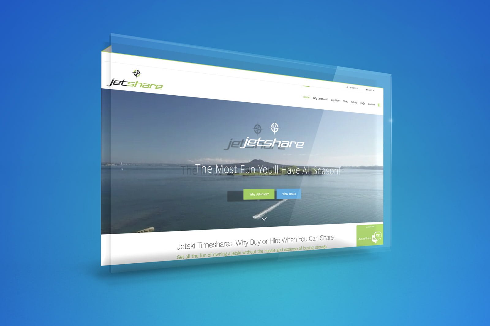
New Website Makes A Splash

Sometimes a website redesign is the best option. Jetshare came to Hart Design with a WordPress website that didn’t quite hit the mark. Having just had it built by another Auckland web developer, owner Aarron was not thrilled by their work.

Understandably, he was reluctant to throw the jetski out with the bilgewater, so to speak. So for 12 months we did what we could with a tight maintenance budget but in the end, working with this poorly executed build was inefficient, and like trying to polish the proverbial.

Finally, Aarron was motivated by a less than desirable conversion rate and agreed that a rethink of the website look and feel was the right course of action. The key reason for the poor website conversions was down to UX (user experience).  The vast majority of Jetshare’s traffic came from mobile and tablet users (a massive 74%). The old site looked clunky on these devices, and a total redesign was the most effective way of improving this aspect of the website design.

We’re big cheerleaders of WordPress; we use it everyday. However web developers can miss the mark if they employ a substandard theme. It’s your starting point for customising WordPress and a bad choice at this early stage can come back to haunt you farther down the track.

Starting with a high quality theme can require a little extra investment on time at the beginning however the long-term payoff is repaid in spades. Our approach to building a website with WordPress is that it’s like preparing the groundwork for future development upfront: later improvements and additions are faster and more flexible and require far less new coding.

Geek warning: it’s true that this approach can produce a heavier site in terms of load speed. But when you know how to counter this it’s all worthwhile ;-)

We started with a new theme that we know we can manipulate to get a modern, eye-catching and feature-rich website. All of our websites are built with a focus on mobile friendly design, as standard. Since we were now redesigning the site from scratch, we looked for opportunities to involve more colour, more text breaks and better use of video and imagery.

In short, working with our tried-and-true method we have applied the polish that was missing from the old website. Simple changes to structure and page design meant an instant facelift for the Jetshare website.

Analysis of before/after data shows a big jump in traffic (37% overall). Engagement is up too, with more pageviews and longer session duration. Breaking down the device usage, mobile sessions have seen a 36% bump, tablet sessions are up 38% and the desktop numbers have increased by 20%. These numbers undoubtedly justify this website development project. 

But it’s out client’s reaction that pleases us most. “Holy cow! Wow! I can’t believe it… I simply love it,” raves Aarron, following the new design reveal. Later: “The new website has definitely lead to more enquiries, that’s because Jetshare now looks more professional. And that’s what this is all about,” says Aarron.

  • mobile friendly web site design
  • modern wordpress web design

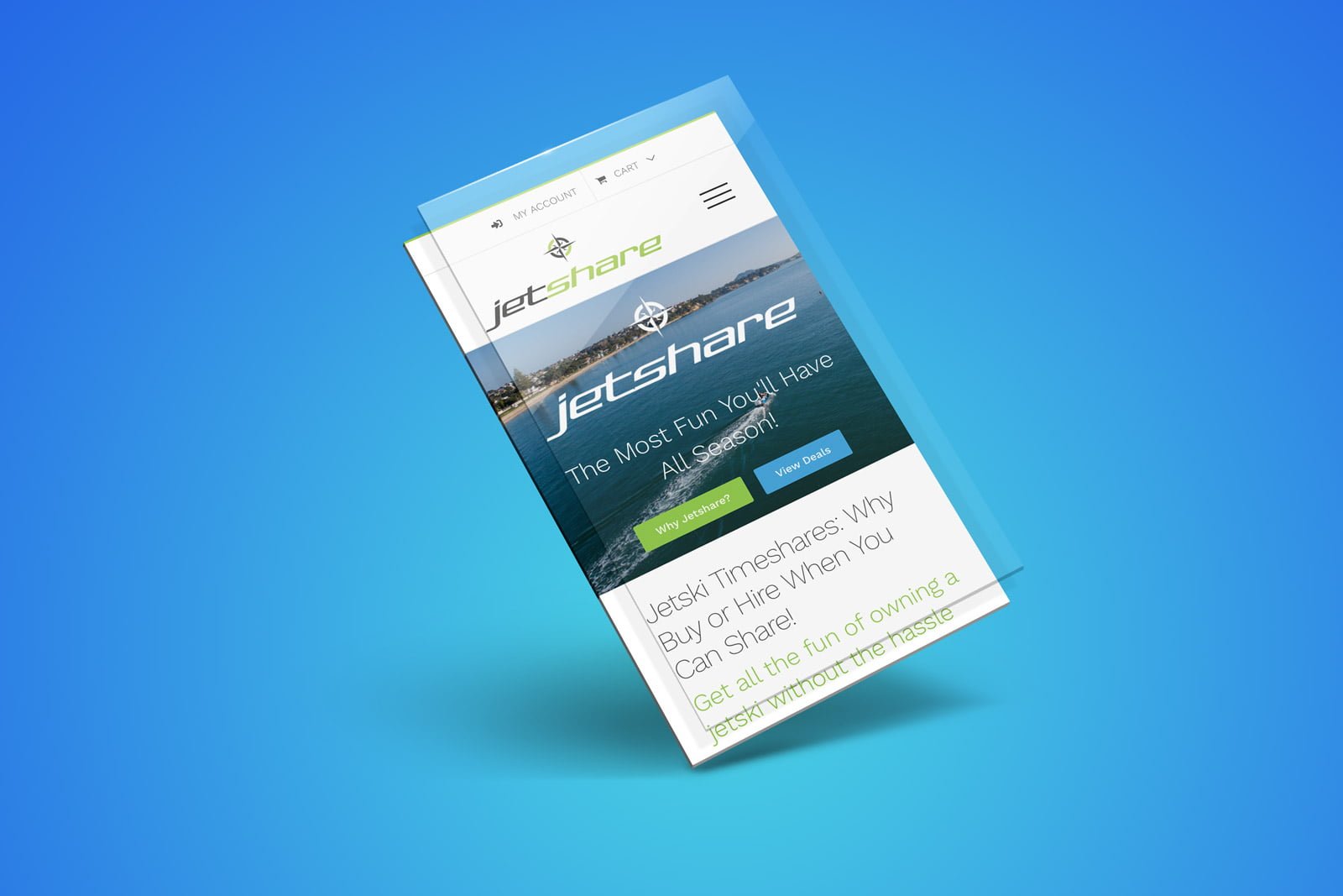
How does your website look on a mobile device?

B2C companies should expect a higher volume of mobile visitors to their website. It’s vital that your website mobile UX is on point.

Stretch Wrap Website & Content