Logo Design

A fresh cut for Contract Flooring’s logo design

Reflecting company values

Operating since the early 80s, Contract Flooring are well-established experts in the commercial flooring game. In 2019 they will usher in a new, professional edge to their corporate image. The first of many design projects on Contract Flooring’s hit-list is a new logo design.

Their old logo wasn’t the worst looking logo design we’ve seen but there were issues with the execution that needed to be addressed. The plan with this rebranding project was to elevate the existing logo design to a higher level, without destroying brand recognition. A logo design should be clean and clear. Less is more as the clichè goes. Consider the function of a logo: to clearly communicate a company’s quality position and values. A busy logo can be detrimental to demonstrating values such as professionalism, confidence, performance and reliability.
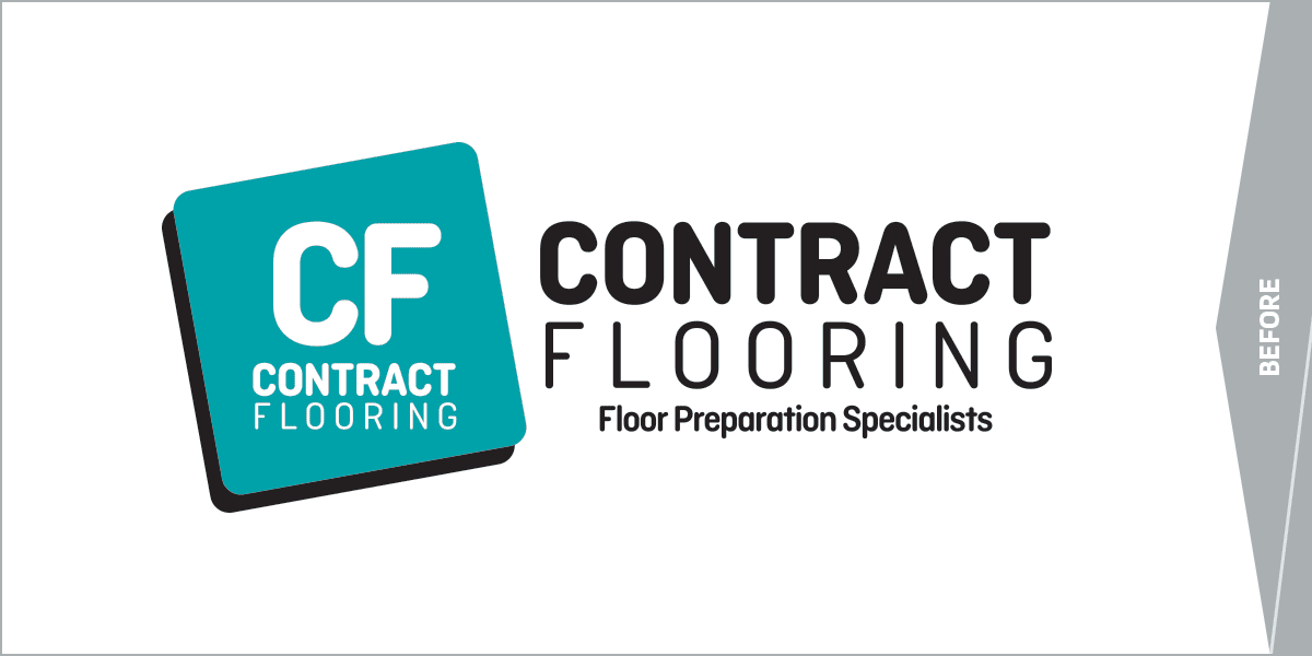
The colours and shape of the logo were features we wanted to work into the new design. While the company name is clear, the bold/light font combo looks a little dated these days. The glaring issue with this logo design was how busy it is. The logo’s ‘tile’ icon contained the initialism CF as well as repeating the full company name underneath that. To top it off, the original designer had slapped a tagline within the logo itself.

At this point we’re up to a character count of 61 characters within this logo design – that’s more like a classified ad than a logo!

“Those small letters were a nightmare to embroider,” notes Carlos Hedge, Director at Contract Flooring.

So our design team set about extracting the good and eliminating the bad.

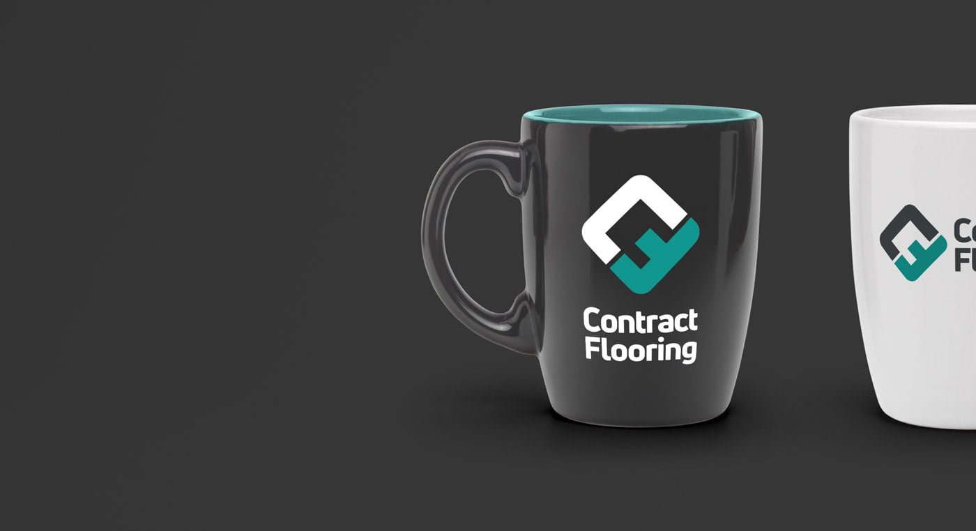
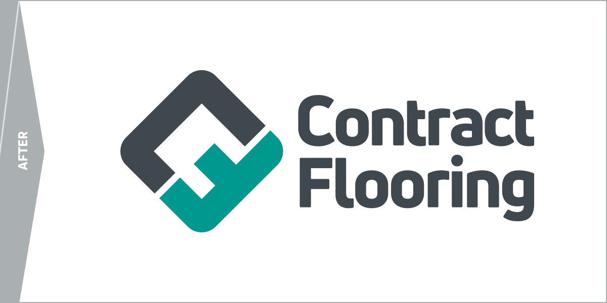
Our logo designers have used a bolder teal colour and replaced the black with charcoal grey to add a little refinement to the design. Grey is a colour that suggests maturity, professionalism and reliability.

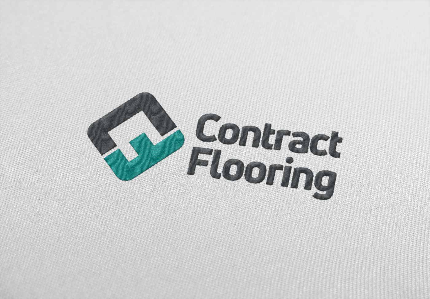
The client liked the tile icon in the original logo so we melded the tile shape with the CF initials to create a stylised graphic that sits alongside a new typeface for the name Contract Flooring. We converted the font from UPPERCASE to Title Case. We favoured the shapes of the lowercase letters in this font, and we felt that Contract Flooring – confident and well-regarded in their industry – doesn’t need to SHOUT their name.

The slightly rounded edges to the font perfectly compliment the rounded corners of the tile graphic.

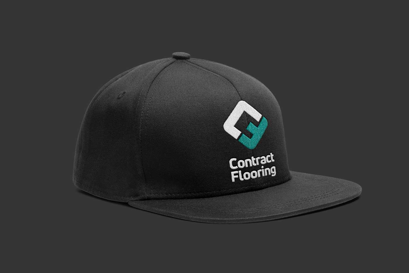
We’ve also created a ‘stacked’ logo variant for when the long rectangle shape isn’t practical. Versatility is a good trait to have with a logo design: it needs to work across all media from print to web to embroidery and signage.

Rebranding

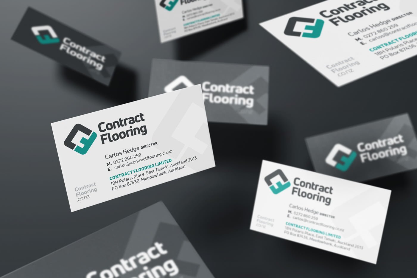
The new logo design is a hit with Carlos. Off the back of this, our team will develop a new brand direction for the company. The logo will inspire fresh branding elements to be used across vehicle signage, corporate stationery and a new website.

Need a professional edge for your logo?

Our expert logo designers know how to elevate your logo design without destroying brand recognition.
Aircon Website Reconditioned