KeyTrack

Logo design for international mission

Conveying a message through logo design

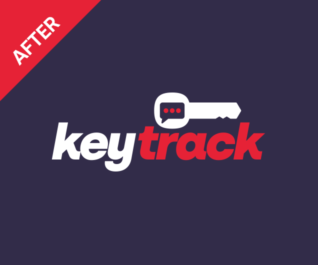
KeyTrack International has been around for almost two decades. Over that time they’ve been quietly enhancing their Property Conveyancing software, building towards a big push into the international market. As that global mission draws near, Director and local entrepreneur Richard Galbraith approached Hart Design to redraw the KeyTrack logo with a contemporary twist.

First impressions do matter. People will often form an immediate feeling about the quality of your product or service based on their reaction to your branding. For KeyTrack, their old logo was serviceable. Yet it lacked imagination, polish and a professional edge.

The new KeyTrack logo design needed to grab attention, spark inspiration and instil confidence that this is a modern software of the highest quality.

Our Auckland logo designers will start with the typeface. Choosing the right font for your logo design is all-important. There are tens of thousands of fonts to choose from, and so this component is often overlooked by logo designers. Many designers will go with their tried and true favourites and often end up with the “serviceable” logo design that KeyTrack once had.

For our logo designers, that approach represents a missed opportunity. The perfect font can elevate a logo design all on its own. Conversely, a poor choice in typography will doom your logo design to failure. (Hello, Comic Sans!)

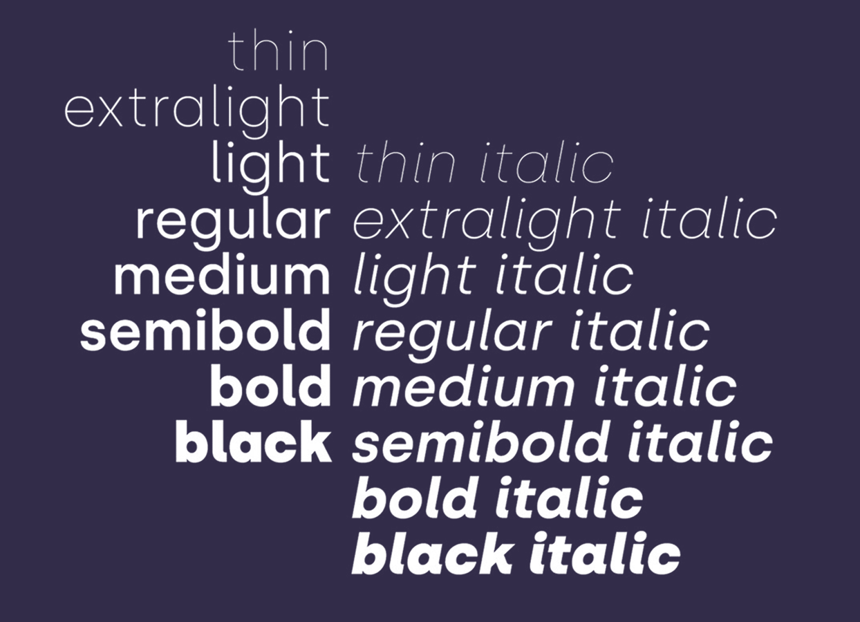
In-depth research led us to a typeface that instantly felt right. Specifically, the Black Italic font style screamed KeyTrack to us. And Mr Galbraith immediately agreed that the selected font is the perfect fit for his software brand. Careful use of kearning (the spaces between letters) adds a professional edge to any logo design.

KeyTrack is a software used by solicitors to facilitate up-to-the-minute communication of Real Estate transactions (conveyancing). It connects property Vendors and Purchasers with their Solicitors and Real Estate Agents so that all parties are informed of their sale and purchase progress in realtime.

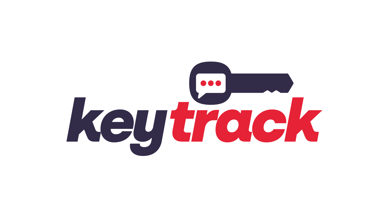
Given the professional nature of the business, the KeyTrack brand should feature appropriate colours. The original KeyTrack logo design got its colour right. Almost. The midnight-blue colour with an accent of red works. However, the shade of red was a little on the garish side. The deep blue lacked… well… depth. We’ve shifted the hues towards more contemporary shades of these colours. The subtle change added new life to the logo design.

A smart icon helps explain what a brand is all about. The key is the obvious element in KeyTrack. But it’s communication that is the beating heart of KeyTrack. That’s why we’ve integrated a modern “message” icon into the KeyTrack logo design. The result is an evocative logo design that meets the need to “grab attention” as set out in the design brief.

Versatility is logo design zen.

As professional logo designers, we always seek to verify that a design will work under changing conditions. We explore how the logo performs on a white background and when we reverse the colours. Is the typeface readable when the logo has to be small? Will it embroider easily? Does it look good on the side of a vehicle?

If the answer is YES to all of the above, then you know you have a great logo design.

For KeyTrack, added considerations included:

  • The launch of their new domain, keytrack.me
  • The major component of the software; the Transaction Status Report, or TSR

We designed a variant of the logo design that promotes the .me domain. While the typeface and message icon combine to give TSR a logo of its own, yet all clearly within the KeyTrack family.

When you develop a logo design beyond itself, it becomes a brand.

Are you looking to relaunch your business with a modern logo design?

Redesign a logo isn’t always about throwing out the baby with the bathwater. For KeyTrack, it was about evolving their design to a higher level to meet their market. If you have a logo design challenge, we should talk.

Forward Plastics